I decided to join the 2022 #30DayMapChallenge to expand my mapping/cartography skills. The goal of the challenge is to make a map a day for 30 days during the month of November based on the theme of the day.
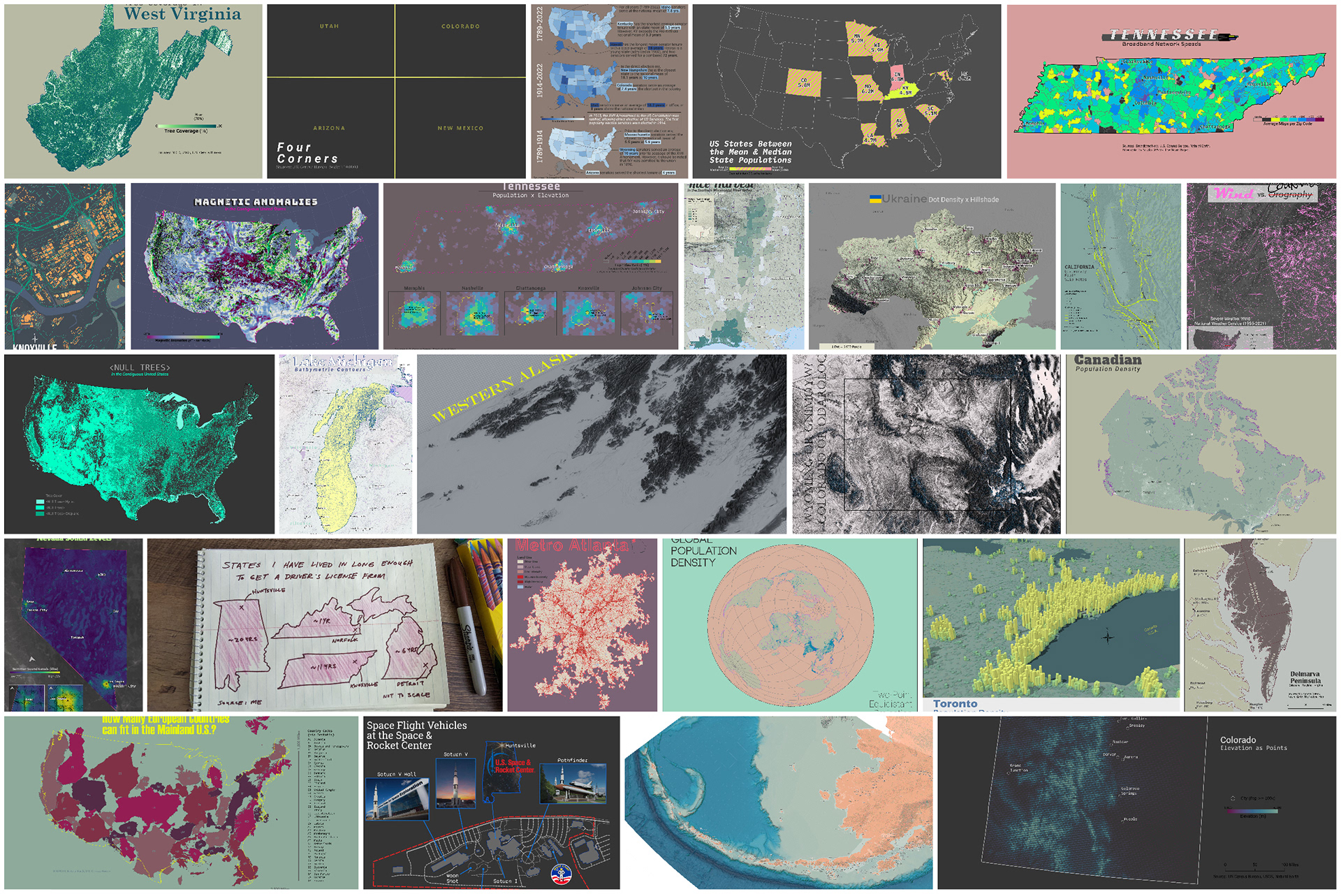
Tools Used
ArcGIS Pro (except for Days 17, 18, 27, and 29)
QGIS (Day 29)
Aerialod (Day 27)
RStudio (Day 18)
Affinity Designer (Days 9, 12, 18, 25, 29)
You can find out more about the annual challenge in the link below.
Week 1
Week 1 was a warm-up for the rest of the month. The first four maps were fairly simple, and you can make them as complex and detailed as you want. I recommend pacing yourself as the days stack up very quickly and it is easy to fall behind.
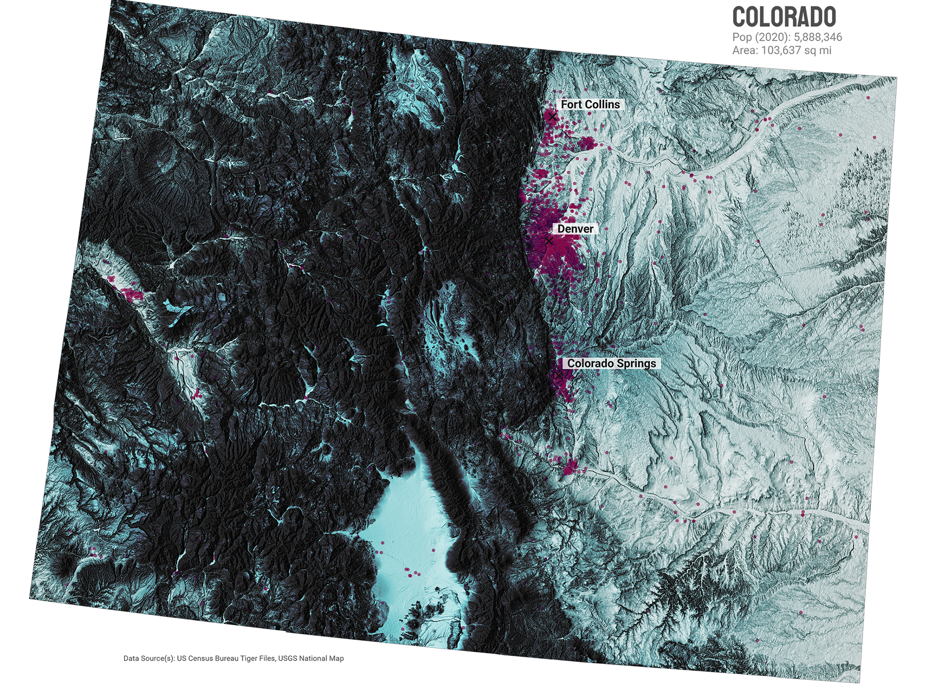
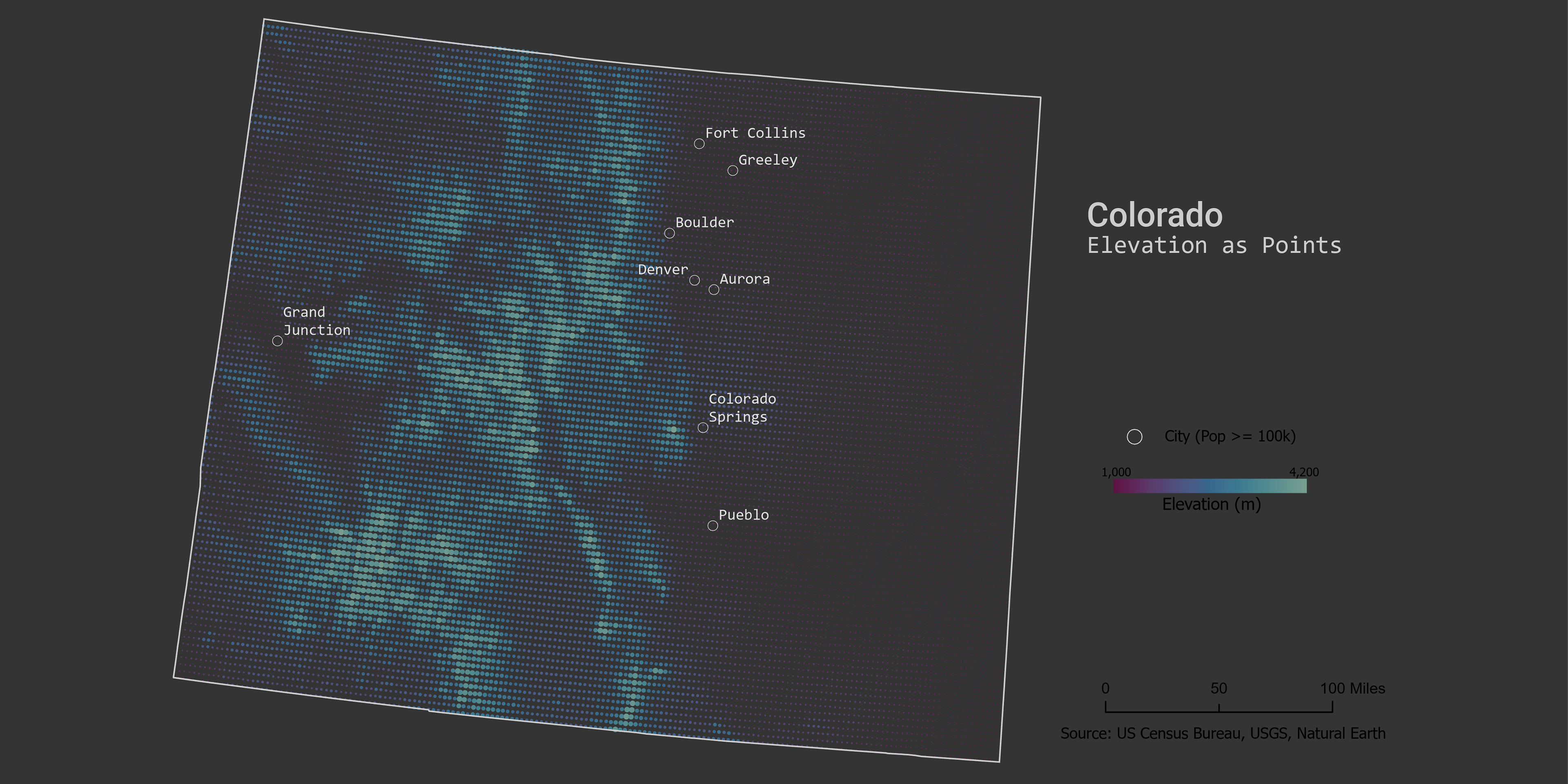
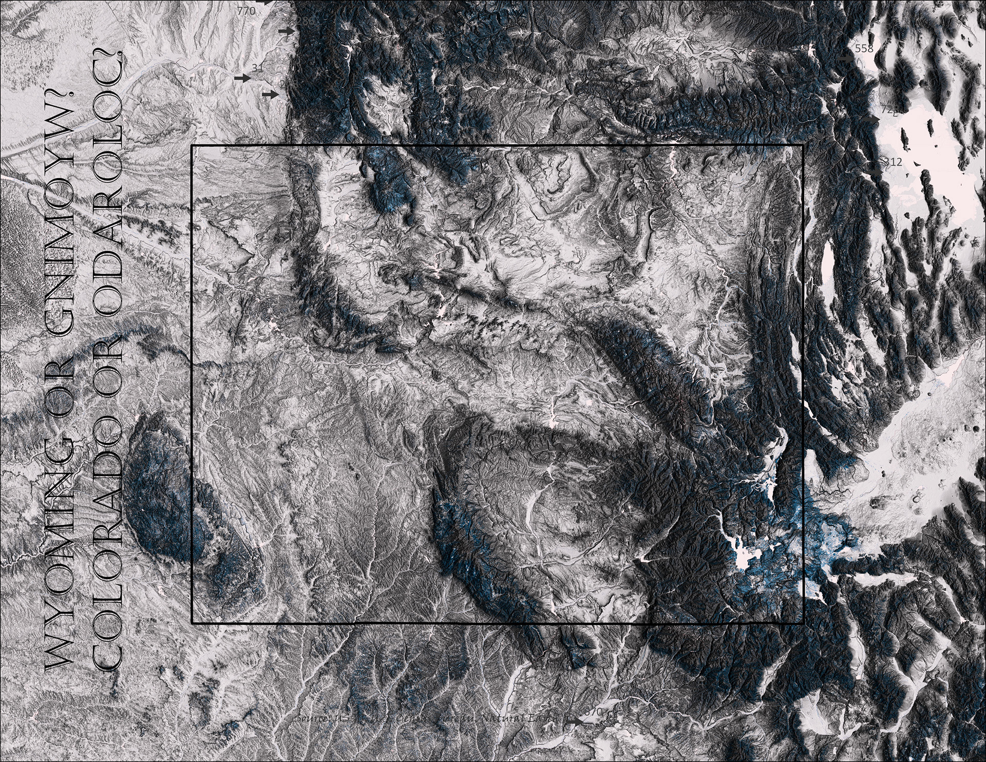
Day 1 (Points) - Colorado Elevation As Points
I clipped and downsampled a DEM; then converted it to points; then symbolized the layer using graduated sizes and colors. However, an easier way to make this map is to use the Vector Field symbology on the DEM layer as described by John Nelson.
Tools: ArcGIS Pro
Day 2 (Lines) - California Quantenary Slip Fault Rates
I symbolized fault line rates (fault slip rates) with graduated line size over a DEM layer. I added earthquake data as points for a sense of fault activity.
Tools: ArcGIS Pro
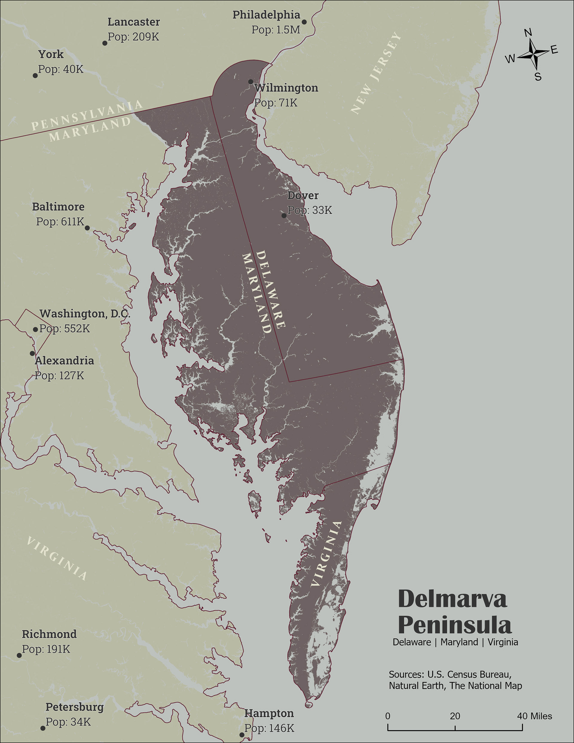
Day 3 (Polygons) - Delmarva Peninsula
I created the proposed state of Delmarva from the three states that make up the Delmarva Peninsula. This required some digitizing to get the desired shape. For the city population labels, I used a small Arcade script.
Tools: ArcGIS Pro
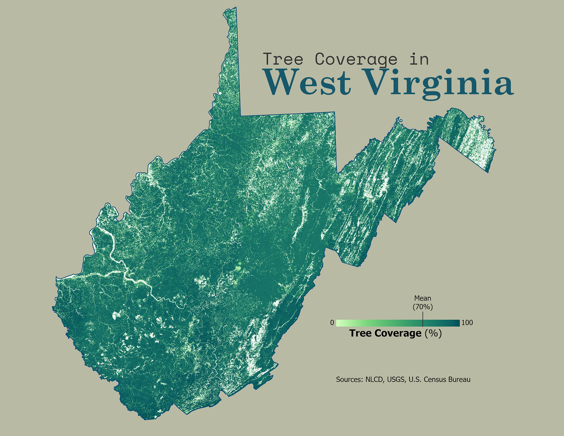
Day 4 (Green) - Tree Coverage in West Virginia
This map is a tree cover raster data clipped to the state of West Virginia and symbolized with a green color ramp.
Tools: ArcGIS Pro
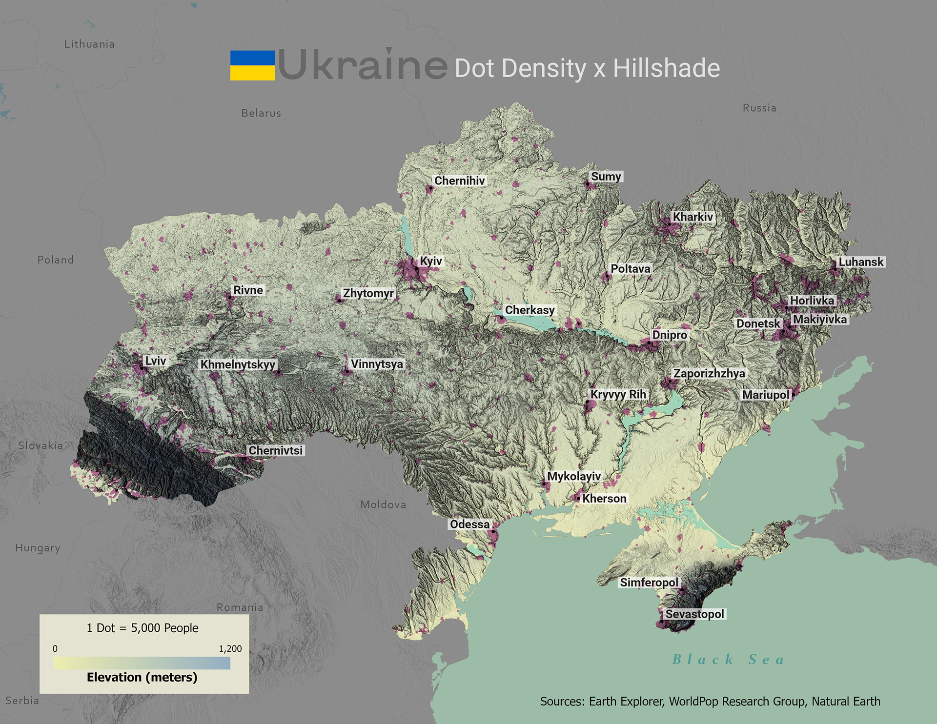
Day 5 (Ukraine) - Dot Density X Hillshade
Since my geographic knowledge of Ukraine was minimal, I decided to stick with the basics: physical terrain and populations. The DEM was symbolized as a hillshade layer and a color ramp with Ukrainian colors; overlaid with a population Dot Density layer.
Tools: ArcGIS Pro
Day 6 (Network) - Tennessee Broadband Network Speeds
A basic choropleth map symbolizing zip codes of TN with average broadband speeds.
Tools: ArcGIS Pro
Day 1 - Points

Day 2 - Lines
Day 3 - Polygons
Day 4 - Green
Day 5 - Ukraine

Day 6 - Network
Week 2
Week 2 was a bit more experimental for me. I incorporated Affinity Designer into more of my projects for more cartographic control.
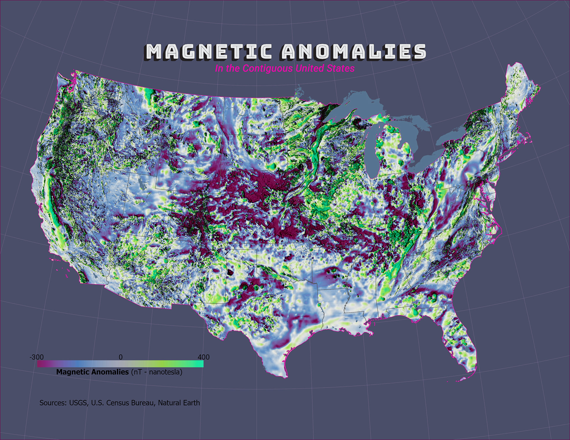
Day 7 (Raster) - Magnetic Anomalies
This raster dataset is from the USGS showing magnetic anomalies created by materials in the earth's crust. The raster was clipped to the US boundary and symbolized using a divergent color ramp. The majority of the map was made in ArcPro; I used Designer to edit the title.
Tools: ArcGIS Pro, Affinity Designer
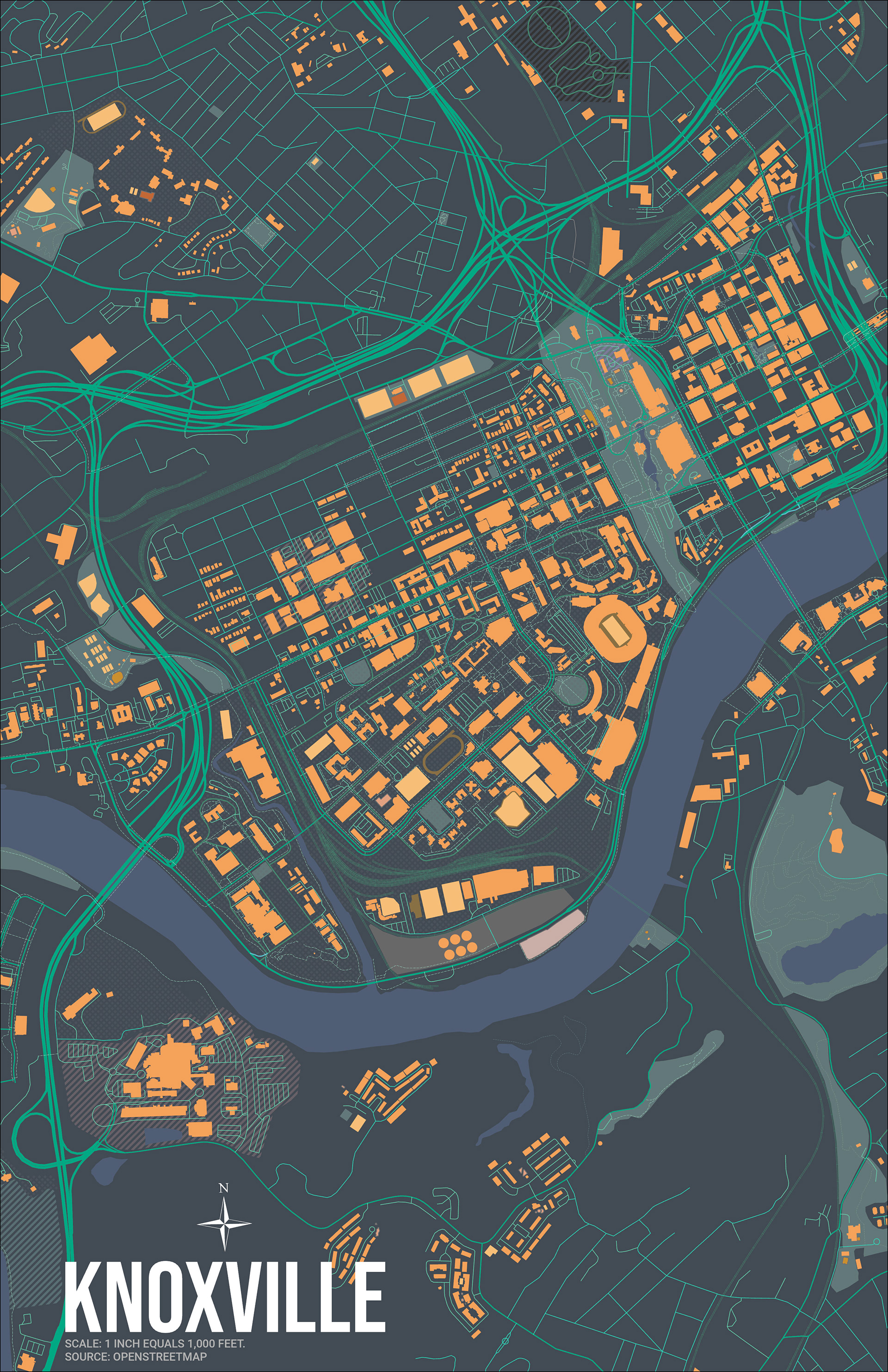
Day 8 (OpenStreetMap Data) - Knoxville
OpenStreetMap (OSM) data can be accessed in a variety of methods, but I used Geofabrik to download state shapefiles and symbolized it as desired.
Tools: ArcGIS Pro
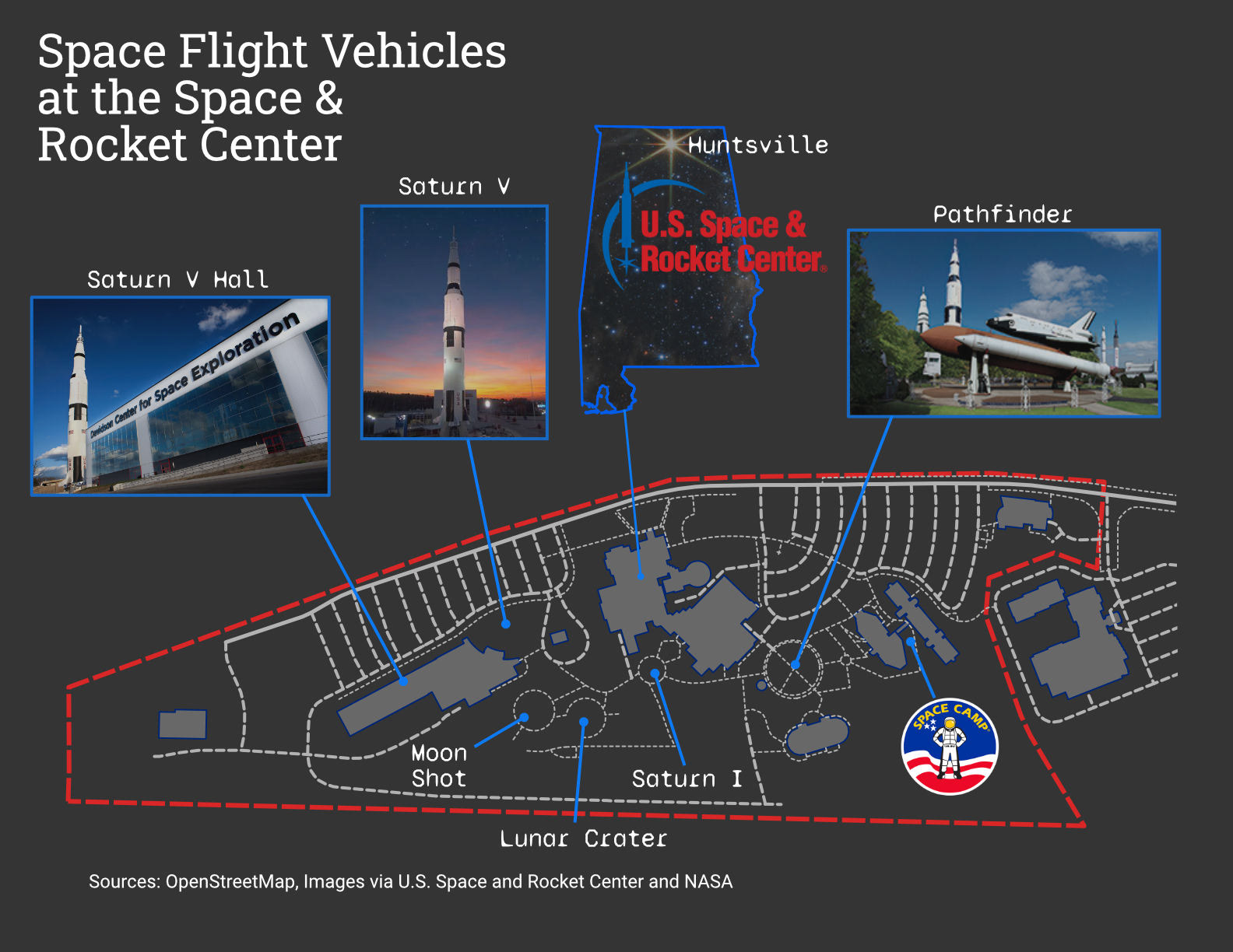
Day 9 (Space) - Space Flight Vehicles at the Space & Rocket Center
This map started in ArcGIS Pro before I migrated the project over to Affinity Designer. I exported the basemap (OSM) as basic shapes in an SVG file. From there, I imported the files into Designer and symbolized the layers, and added the images and text.
Tools: Affinity Designer, ArcGIS Pro
Day 10 (Bad Map) - ???
I'm not sure what's going on here.
Tools: ArcGIS Pro
Day 11 (Red) - Developed Areas of Metro Atlanta
Atlanta is known for its urban sprawl, and I wanted to map that sprawl without using a population density layer. The NLCD land use raster layer was clipped to the metro Atlanta area, and all other uses were symbolized as a tan-ish color.
Tools: ArcGIS Pro
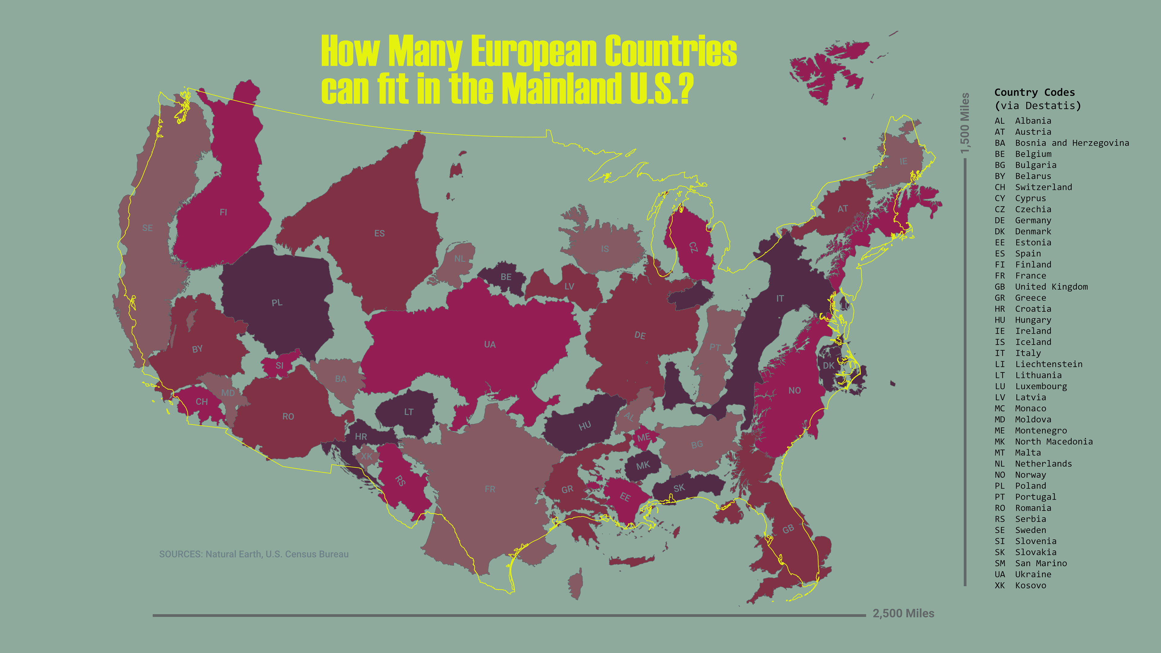
Day 12 (Scale) - How Many European Countries can fit in the Mainland U.S.?
One of the toughest things to do in geography is to maintain a sense of scale for countries on the other side of the planet. Projections like Mercator distort mid-to-high latitude countries, making them appear much larger than they actually are. My initial plan was to pair up European countries with similarly sized American states (see France/Texas or UK/Florida); however, due to the time constraints of the challenge, I had to abandon that idea.
The key to making this map is to set up both maps at the same scale in ArcGIS (with the appropriate projection) before exporting them as an SVG to your vector software of choice.
Tools: Affinity Designer, ArcGIS Pro
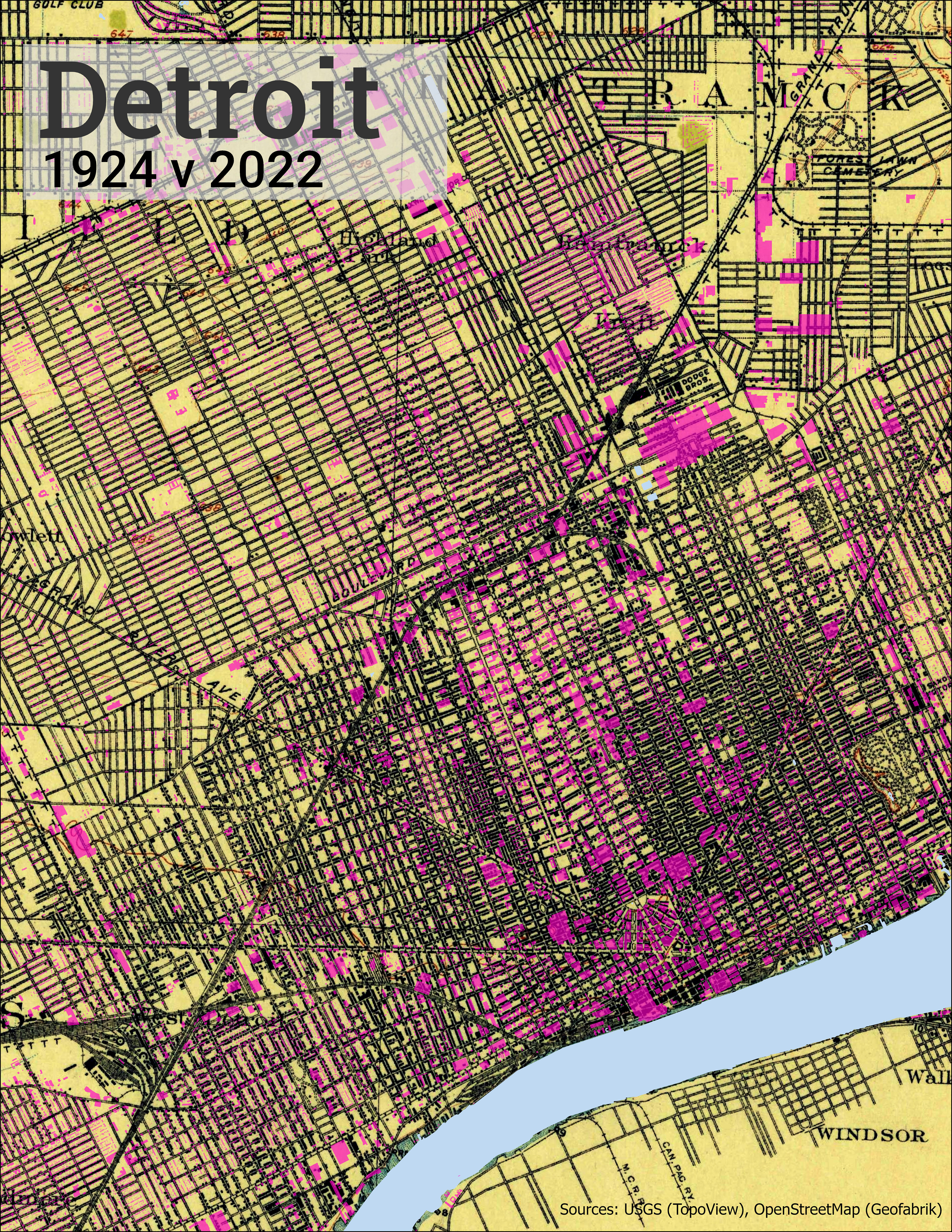
Day 13 (5-Minute Map) - Detriot 1924 v 2022
This was probably the toughest map of the challenge. I thought I would keep it simple with a topo and OSM data; however, I found that my time ran out very quickly and I only made very minimal changes to the default colors.
Tools: ArcGIS Pro
Day 7 - Raster
Day 8 - OpenStreetMap
Day 9 - Space
Day 10 - Bad Map

Day 11 - Red
Day 12 - Scale
Day 13 - 5 Minute Map
Week 3
Week 3 was probably my last full week of good ideas. Not that I had anything planned out from the beginning, but I had enough creativity to have at least one backup idea per day so far. Now the "challenge" part of the challenge was really settling in, and we were just getting to the halfway point.
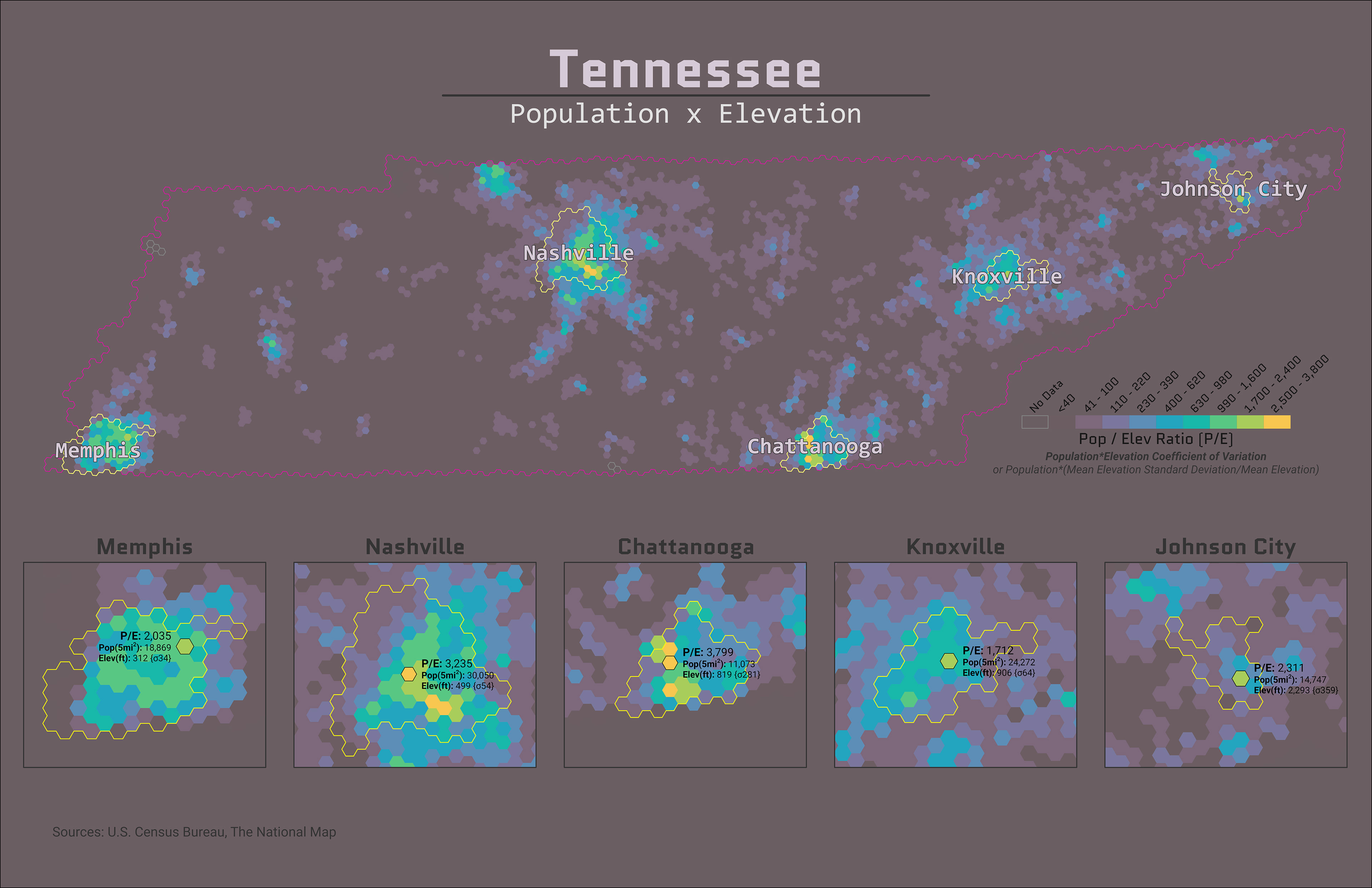
Day 14 (Hexagon) - Tennessee: Population X Elevation
This map is a smaller version of the map I made for the TNGIC Fall Forum. On this version, I created inserts for the four largest cities in Tennessee. I used an Arcade labeling expression for the labels for each city.
Tools: ArcGIS Pro, Affinity Designer
Day 15 (Food/Drink) - Rice Harvest in the Southern Mississippi River Valley
This map is basically a choropleth with USDA data and a hillshade layer underneath. After I posted this map, another user mentioned that Arkansas grows the most rice in the country. I was a little surprised, as I expected South Carolina or California to be #1.
Tools: ArcGIS Pro
Day 16 (Minimal) - Four Corners
Minimalist maps are very simple in design but very difficult to execute well. The reader needs some knowledge of the map to fill in the missing information. Hopefully, this map explains itself.
Tools: ArcGIS Pro
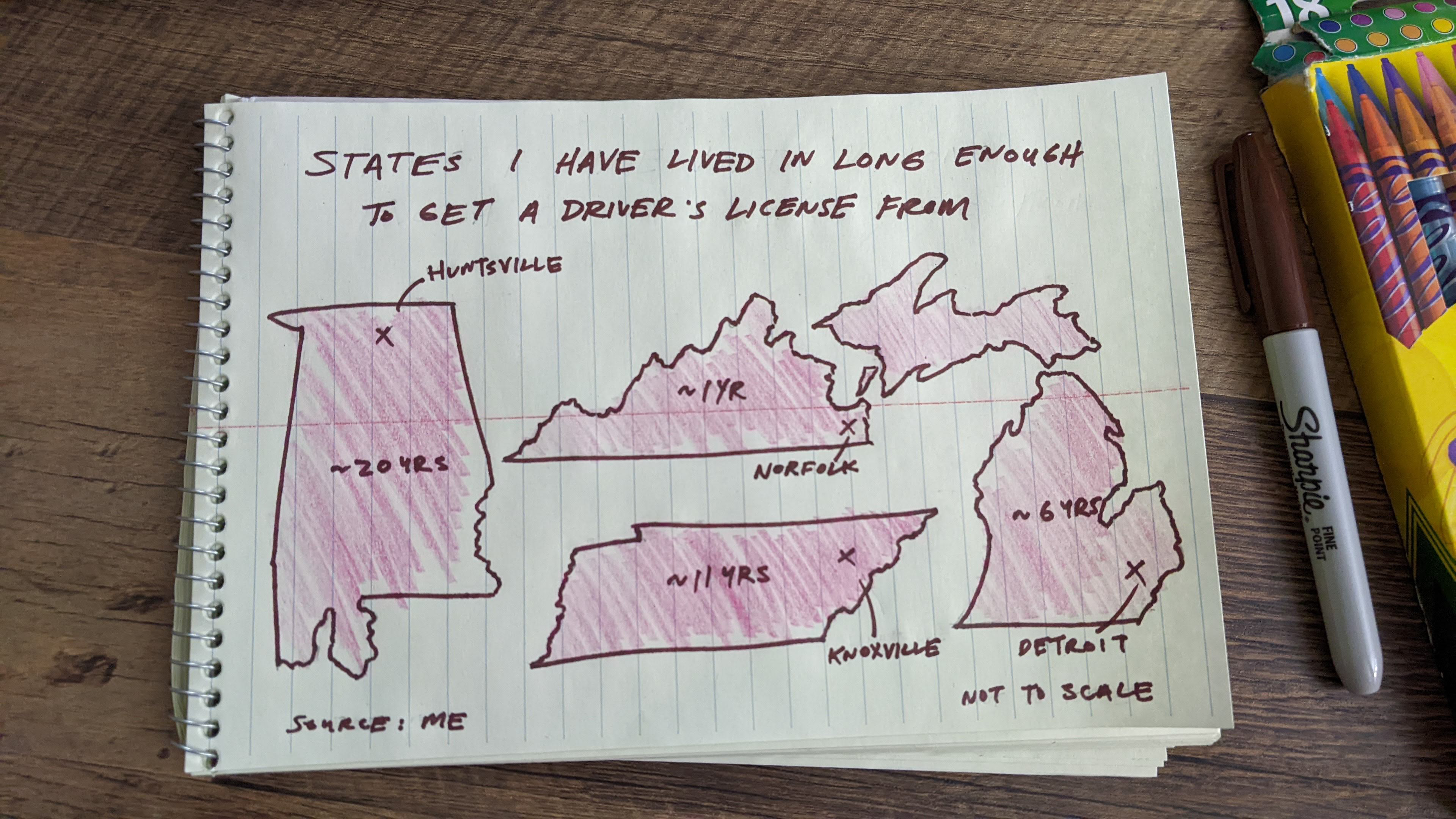
Day 17 (A Map without a Computer) - States I Have Lived In...
I decided to draw most of the states I have lived in, or at least long enough to get a driver's license from.
Tools: Color Pencils, Sharpie, Notepad
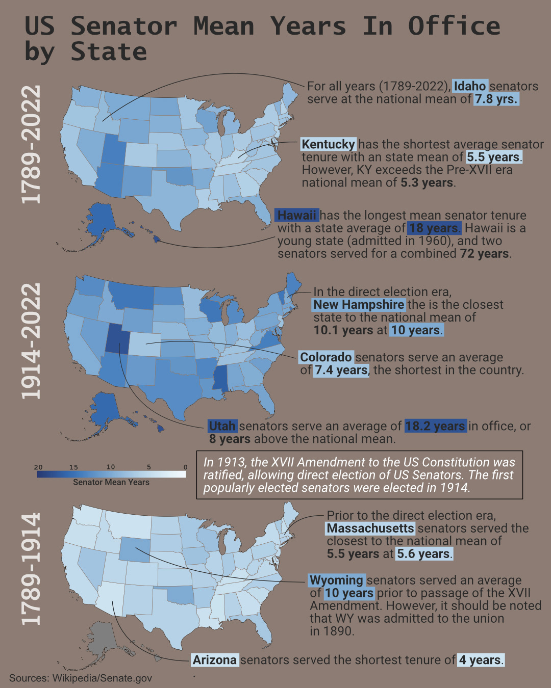
Day 18 (Blue) - US Senator Mean Years in Office by State
I got the idea from a map posted by another user. He wasn't participating in the challenge, but it sparked a question. Which states have the longest average tenure for U.S. Senator?
I found the data on the Senate's website, but it was in tabular form on Wikipedia. I downloaded the data with Excel and imported it into R. Each sub-map was generated in RStudio and exported to Affinity Designer for final assembly.
Tools: RStudio, Affinity Designer, Microsoft Excel
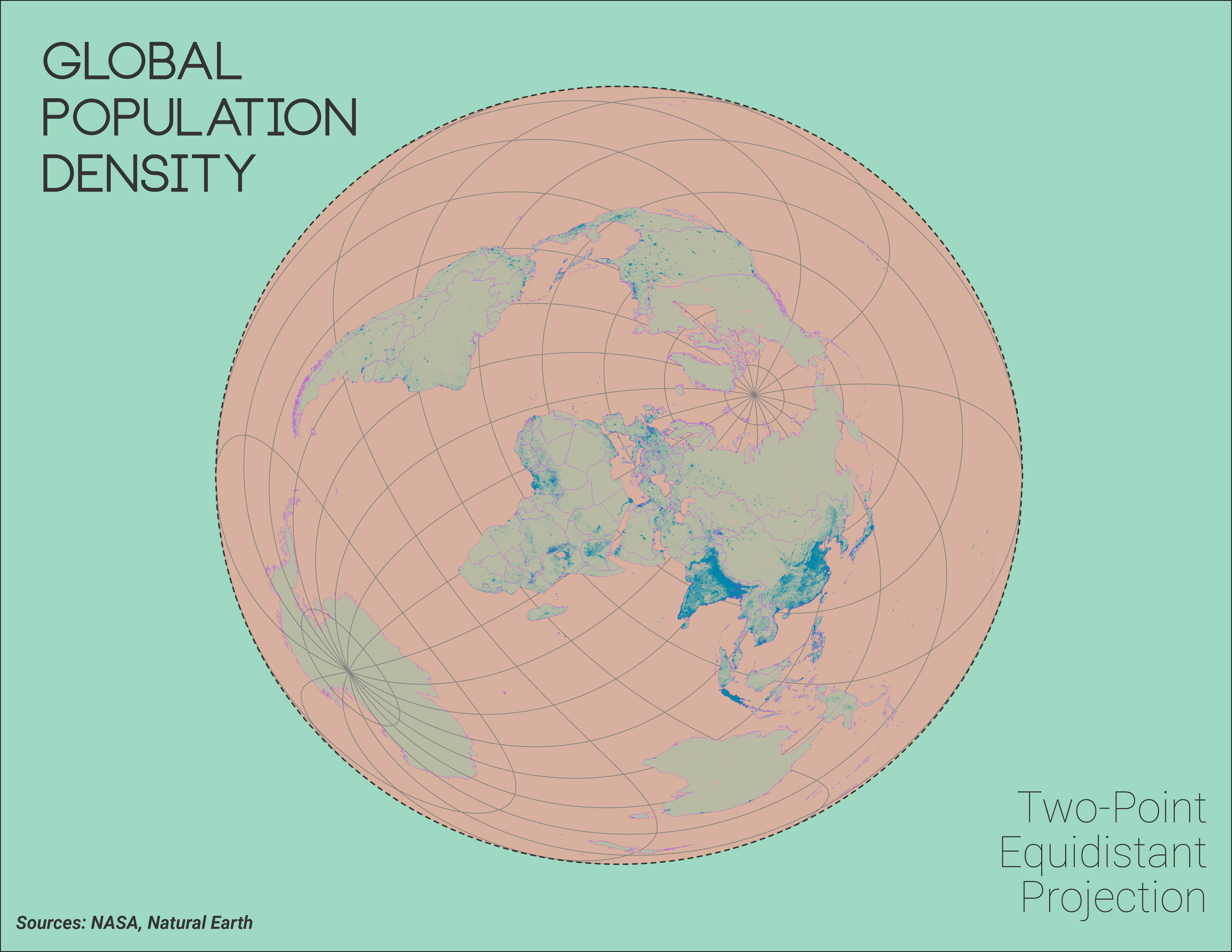
Day 19 (Globe) - Global Population Density w/ Two-Point Equidistant Projection
My initial plan was to create a 3D global map; however, my computer had other plans. To complete the map in time, I used a Two-Point Equidistant Projection to keep things interesting.
Tools: ArcGIS Pro
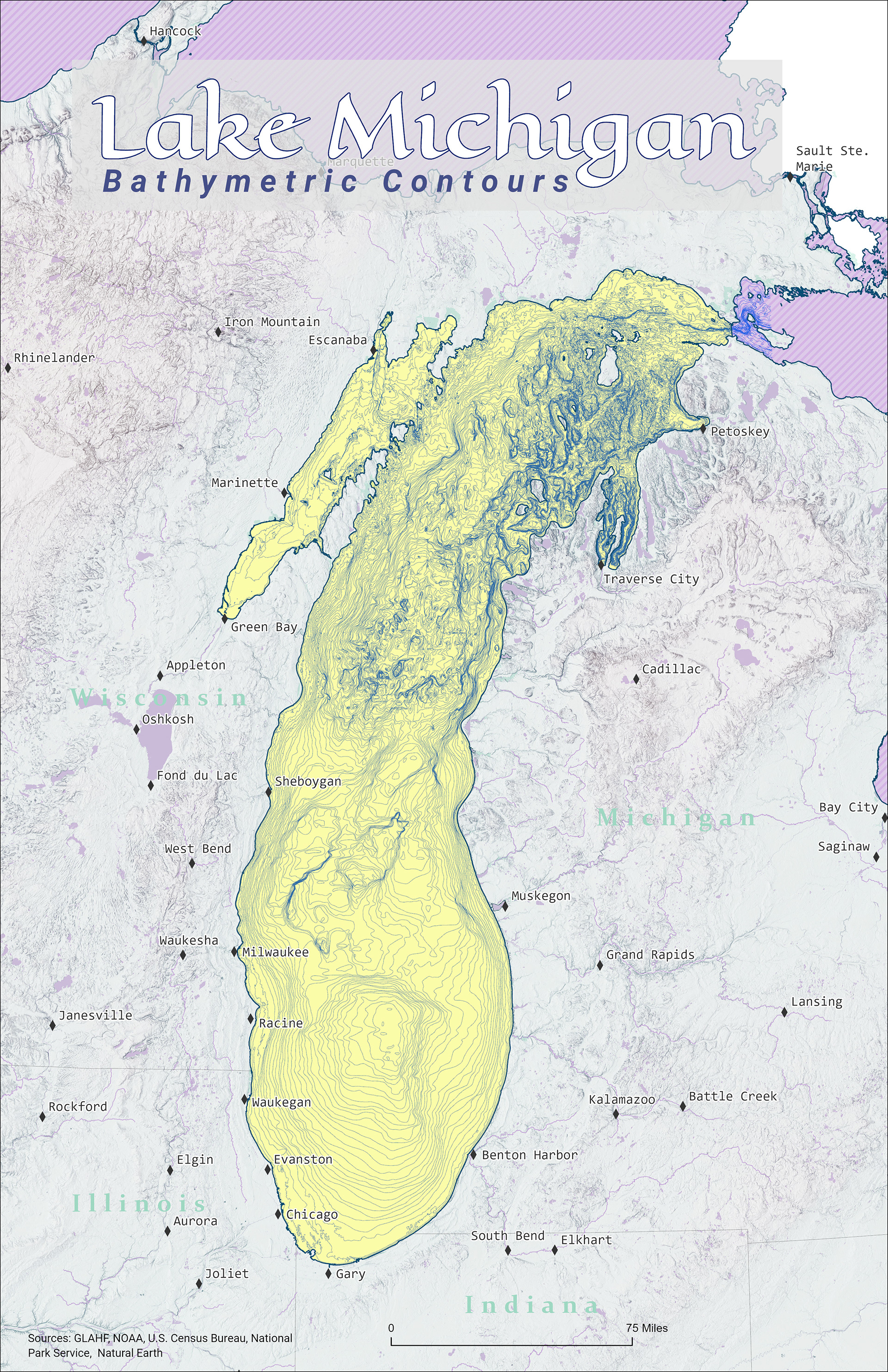
Day 20 (My Favorite...) - Lake Michigan Bathymetric Contours
Lake Michigan is my favorite body of water. I first visited it in the late 90s, and I couldn't believe how large and cold it was. I have been back several times since, mostly on the Michigan side of the lake. Bathymetric contours are available from NOAA as shapefiles.
Tools: ArcGIS Pro
Day 14 - Hexagons

Day 15 - Food/Drink

Day 16 - Minimal
Day 17 - A Map Without a Computer
Day 18 - Blue
Day 19 - Globe
Day 20 - "My favorite..."
Week 4
Week 4 was a struggle. My creativity was waning, and I noticed quite a bit of dropoff in participation as well. The holidays were fast approaching as well. I skipped Day 24 (Fantasy) due to time constraints from the Thanksgiving holiday.
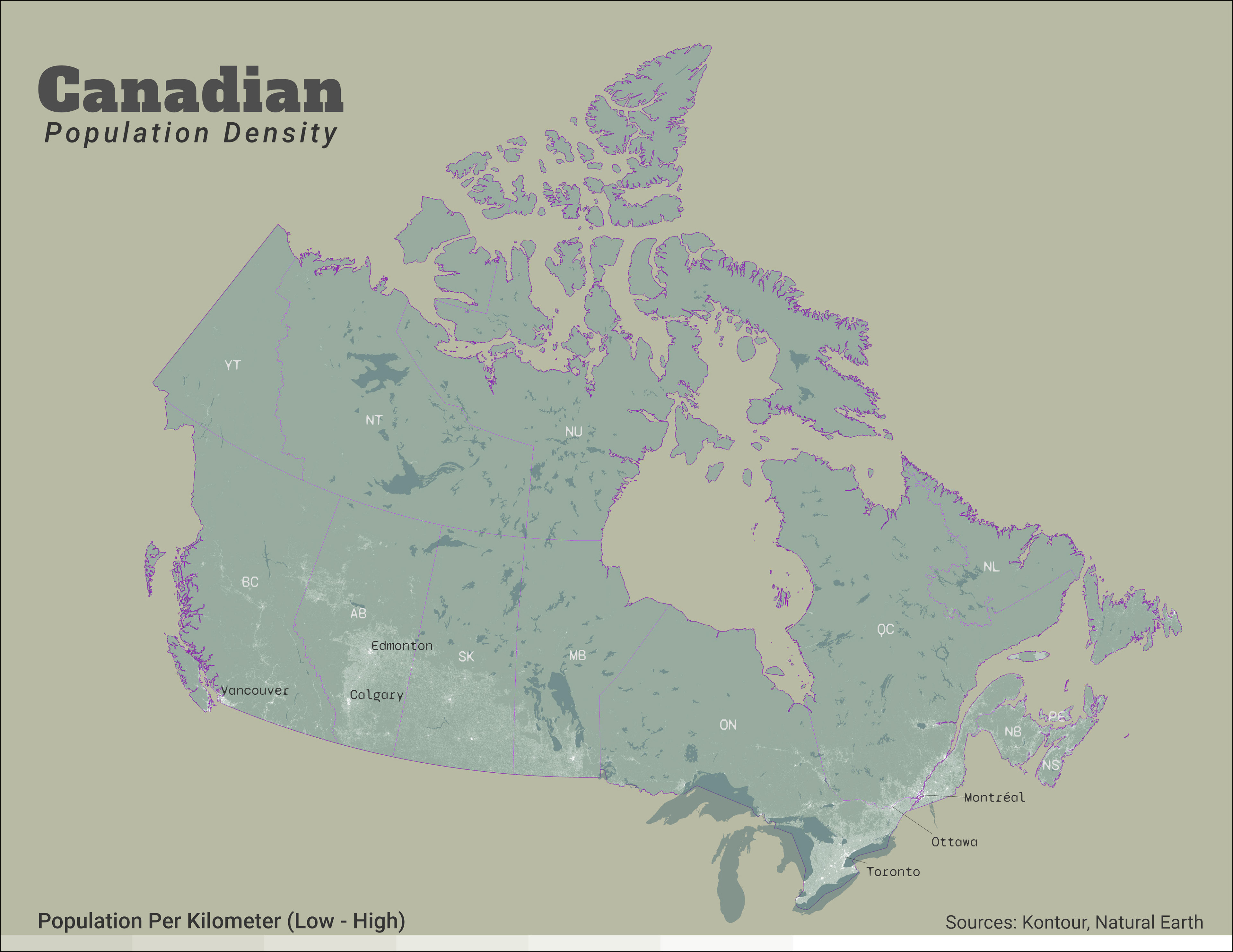
Day 21 (Kontur Data) - Canadian Population Density
For this map, I wanted to see the population distribution of Canada. I've heard many times that most of Canada's population lives near the southern border, so I wanted to see for myself.
I wish I had known about this dataset earlier in the challenge, but that's partially what the challenge is for. The main dataset is HUGE! It contains the entire global population at several gigs worth of data. There are smaller datasets at the country level so look for those if you want to work with this data.
Tools: ArcGIS Pro
Day 22 (Null) - Null Trees
Initially, I was curious about where trees were not located throughout the United States. So I used the national land cover raster and removed the tree symbology from the layer. I did want to differentiate croplands from barren or other treeless areas, so I added in the cropland raster from the USGS. Fair warning, if you download the data from NASA it is only available in small sections, and you will need to download and mosaic 27 rasters to get full coverage of the lower 48.
Tools: ArcGIS Pro
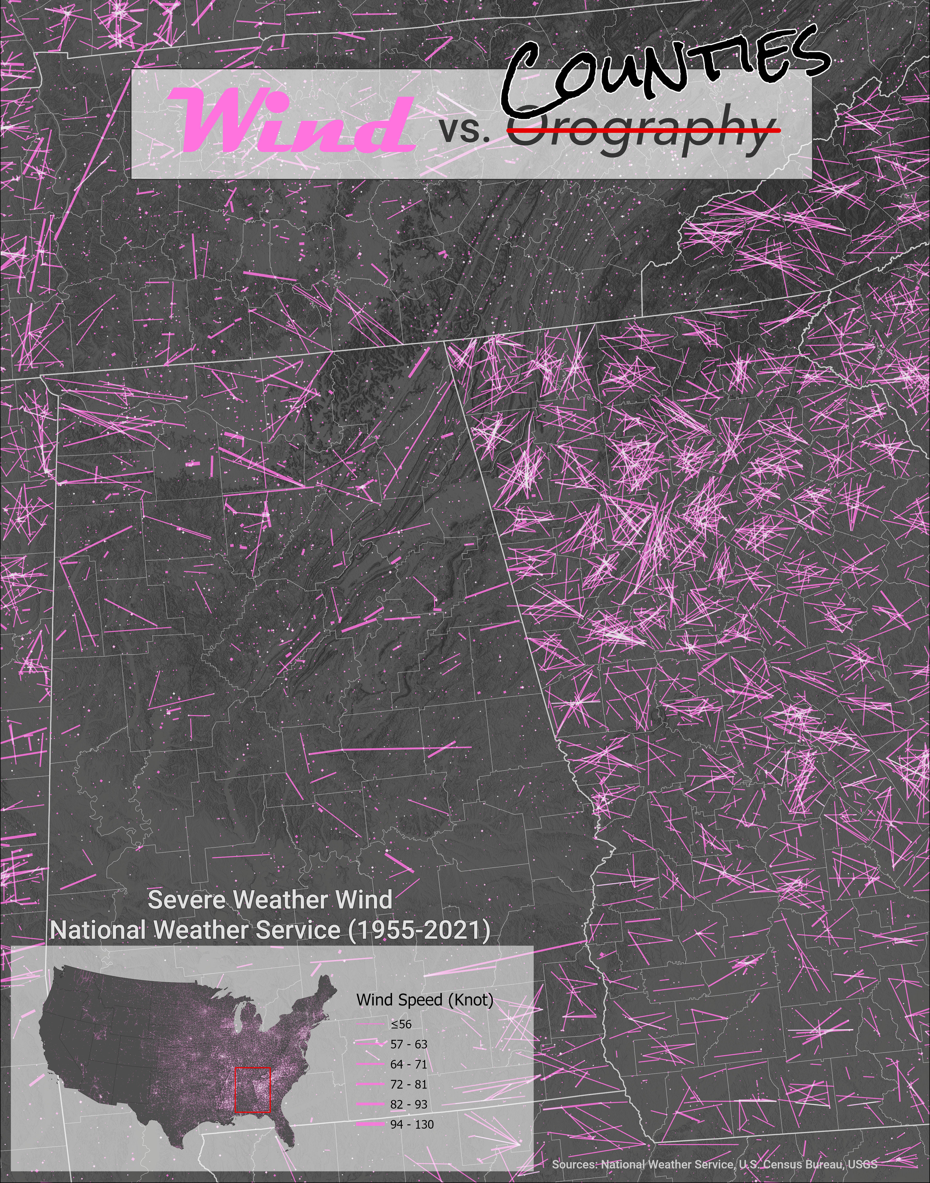
Day 23 (Movement) - Wind vs Counties
On my first attempt, I tried to use NetCDF wind data from NASA. My goal was to show the orographic effect of mountains on the wind. Unfortunately, I couldn't figure out how to convert the raster data into polyline data.
I found wind data in a shapefile format from the National Weather Service; however, after I downloaded it, I realized there was a problem. All of the wind seemed to end at county borders. In fact, some states had far more data than others. This seems to be a data reporting or collection issue. Either way, data issues are something we must be mindful of when making maps.
Tools: ArcGIS Pro
Day 25 (2 Colors) - States Between the Mean & Median Populations
The United States has a population of 330 million and 50 states. I was curious about which state represented the average state population (it was Indiana at 6.8m). Since the data is skewed, the median state is a better example to use. In this case, the median state is Kentucky (4.5m). This may not seem like a lot, but there are 8 states (16% of the total) between the median and the mean.
Tools: ArcGIS Pro, Affinity Designer
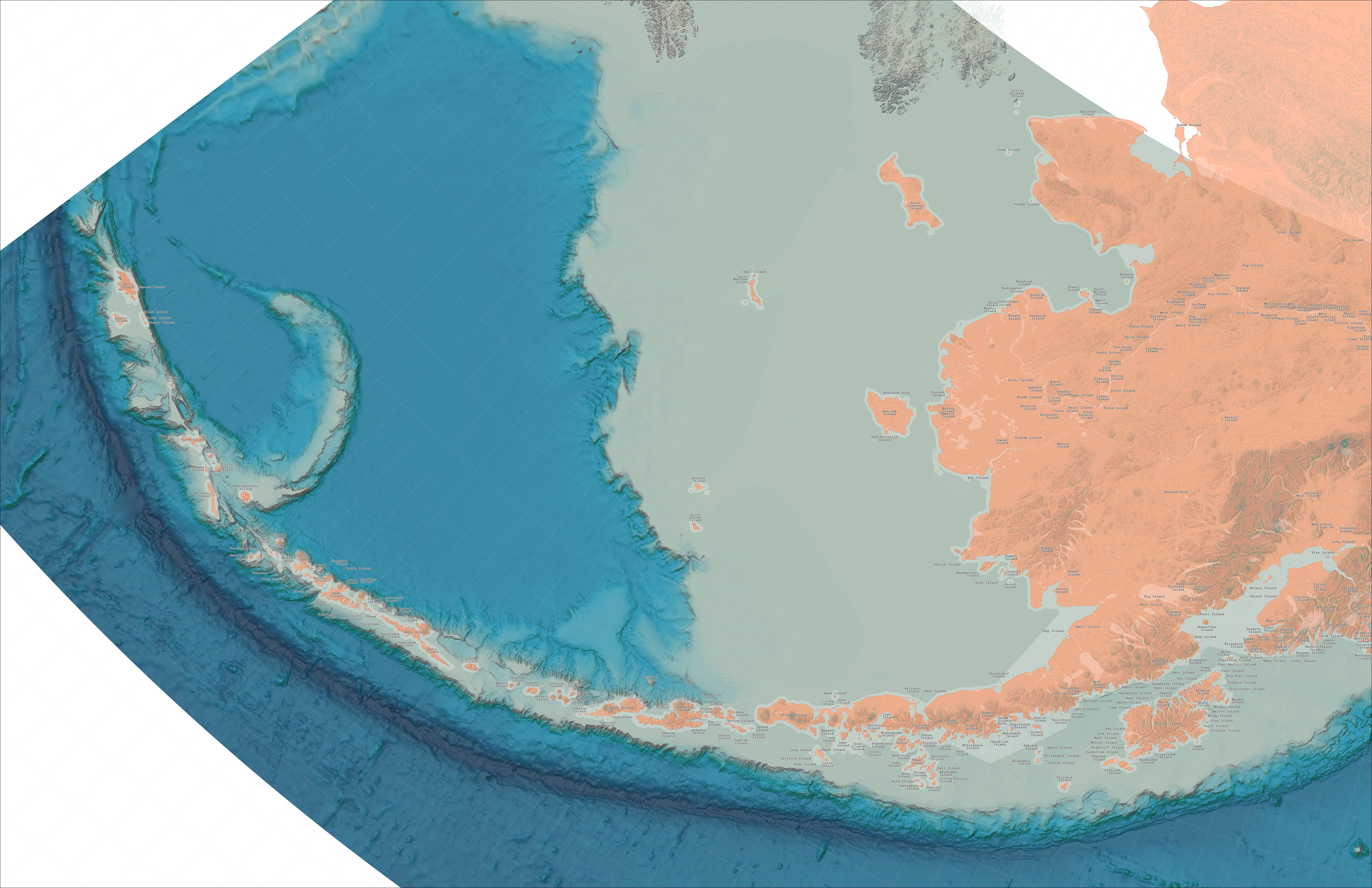
Day 26 (Islands) - Alaskan Islands
This map I fell behind early on and more or less never recovered. I ran a geoprocessing routine that took 4hrs that didn't give me the results I wanted. The correct routine took nearly 20hrs to complete. The gradient for the Hillshade is a customized color ramp that corresponds with certain elevations. So far, it is a trial and error process.
The main goal was to break up the Aleutian Islands into individual parts, then use GNIS data to give them labels. I used the Areal Hydro layer from the Census to create many of the smaller islands. However, that process took 20 hrs!
This map is currently a work in progress.
Tools: ArcGIS Pro
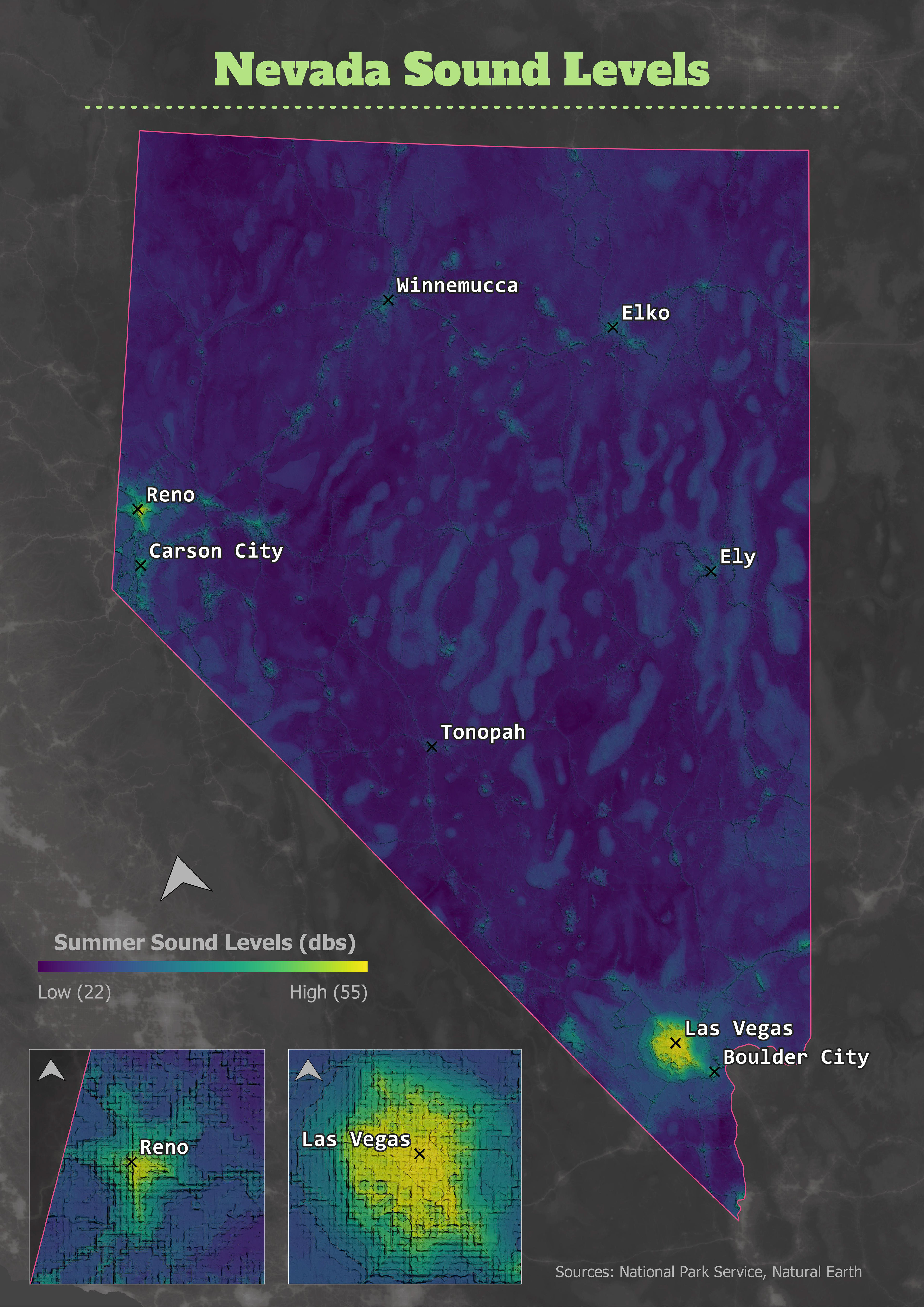
Day 27 (Sound) - Nevada Sound Levels
While waiting for the Day 26 map to finish a process, I started on the Day 27 map. To keep from crashing ArcGIS Pro, I decided to try QGIS. Since I spent most of my time getting up to speed on QGIS, I decided to keep this map simple.
The dataset is from the National Park Service and is a model of daytime summer sound levels. I converted one copy into a hillshade to give it a 3D effect and overlay a graduated color layer on top.
Tools: QGIS
Day 21 - Kontour Dataset

Day 22 - Null
Day 23 - Movement

Day 25 - 2 Colors
Day 26 - Islands (WIP)
Day 27 - Sound
Week 5
Week 5 almost didn't happen for me. It felt like I was just going through the motions with the same old ideas. The "challenge" part of the challenge had taken root, and many of the participants had fallen away. So finding inspiration from my fellow mappers was very difficult. And I was still working on Day 26!
Day 28 (3D) - Toronto Population Density
This map was an extension of the Day 21 map with the Kontur dataset. Once you convert the map frame into a 3D scene, you can extrude the polygon layers to your liking. Since the 3D map took up so many CPU resources, I exported it to Designer for the final touches.
Tools: ArcGIS Pro, Affinity Designer
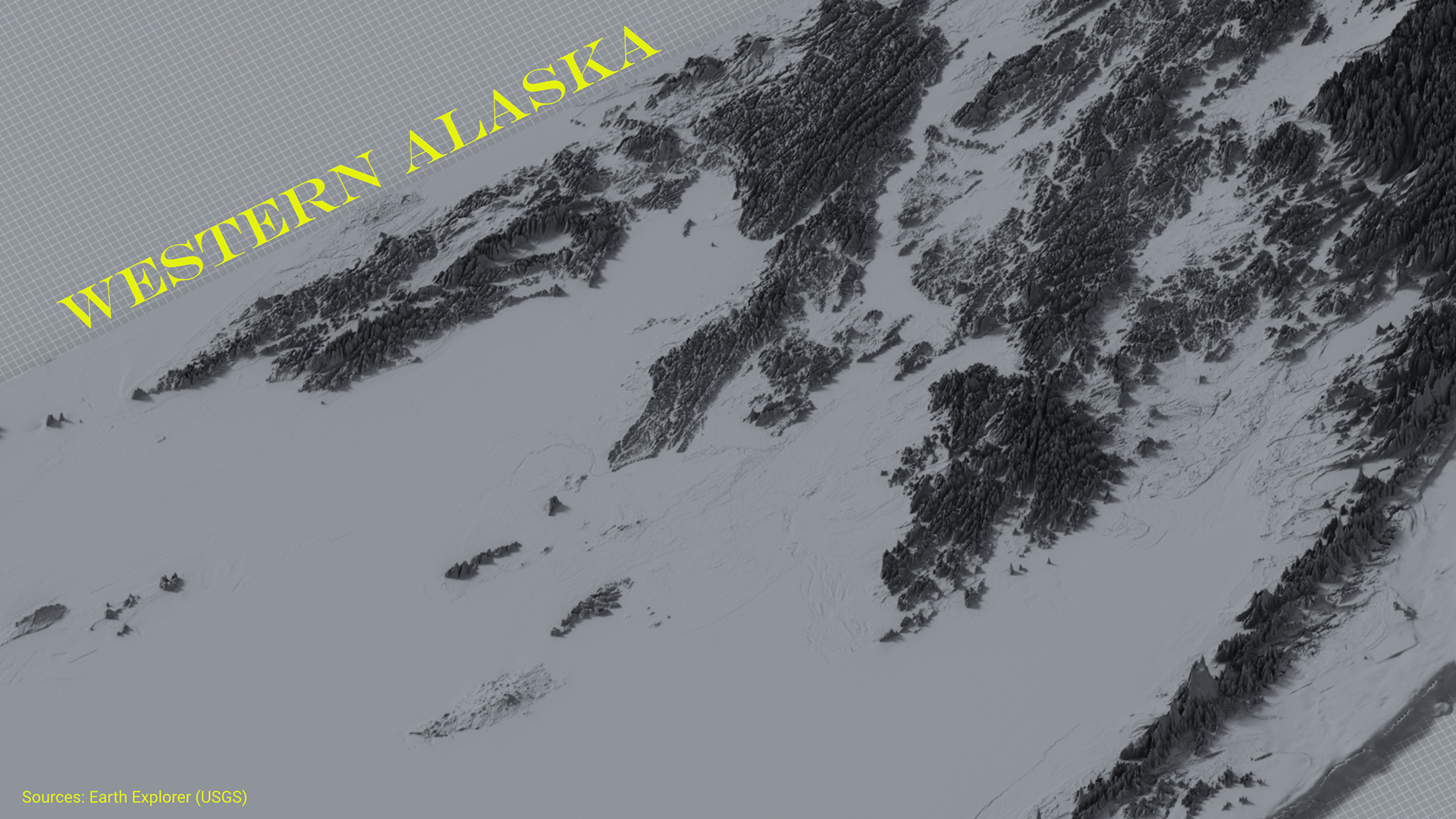
Day 29 (Out of my Comfort Zone) - Western Alaska
While I was still working on my Island map, I decided to give Aerialod a try. 3D is definitely outside of my wheelhouse and documentation for this software is minimal. I used this write-up to get up to speed on Aerialod. The DEM is the same raster I used for the Alaskan Islands map. It is interesting how the same raster can look radically different. I added text in Designer.
Tools: Aerialod, Affinity Designer
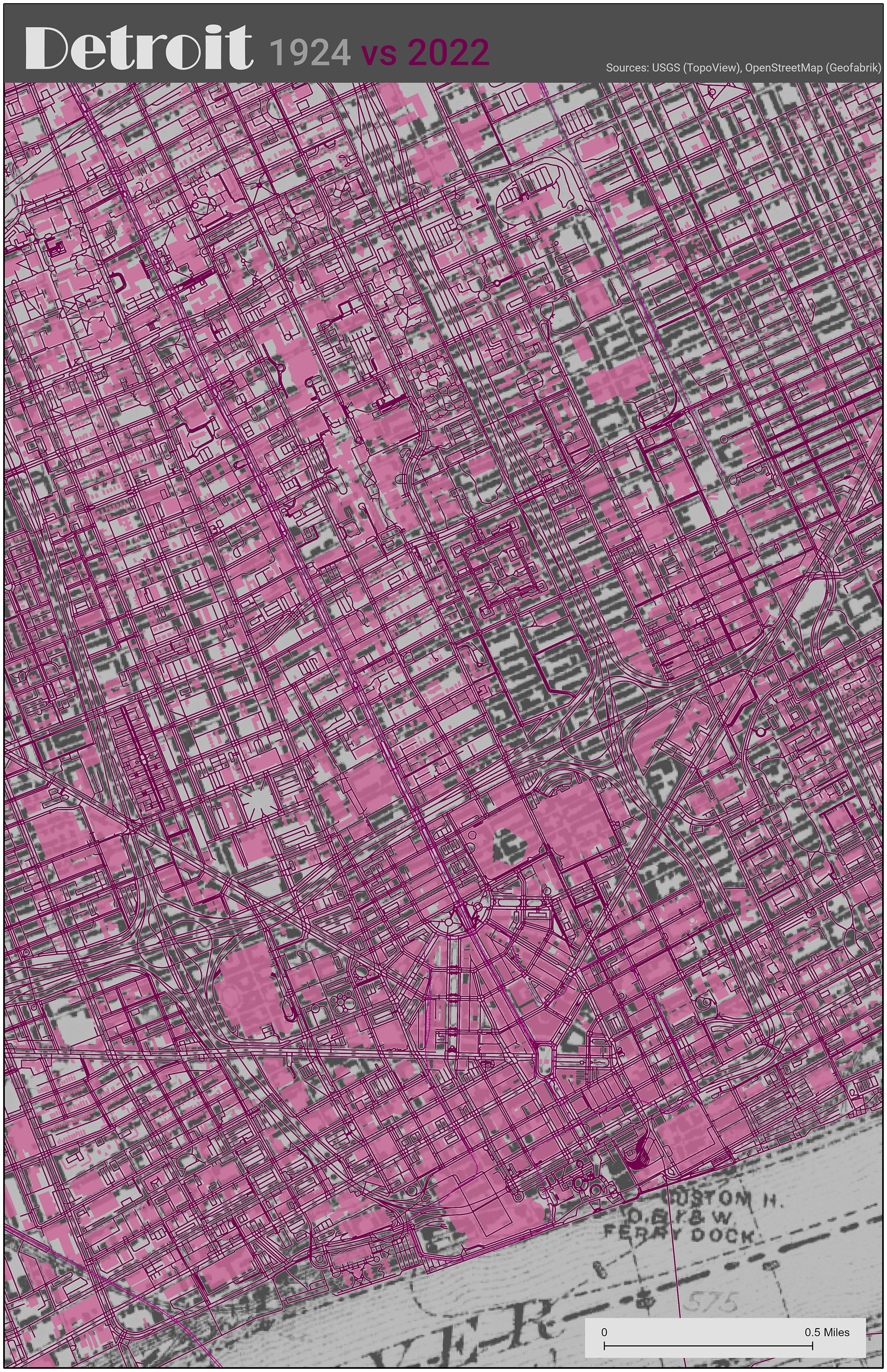
Day 30 (Remix) - Detroit: 1925 vs 2022
For the final map, I decided to take another crack at my 5-minute map. The topo layer was a little too strong on the first map requiring strong colors on the vector layer to compensate. By changing the raster to a grayscale, we can lower the color intensity of the buildings and road layers while still being able to see the differences between the two layers.
Tools: ArcGIS Pro

Day 28 - 3D
Day 29 - Out of my Comfort Zone