2023
Above the Mean
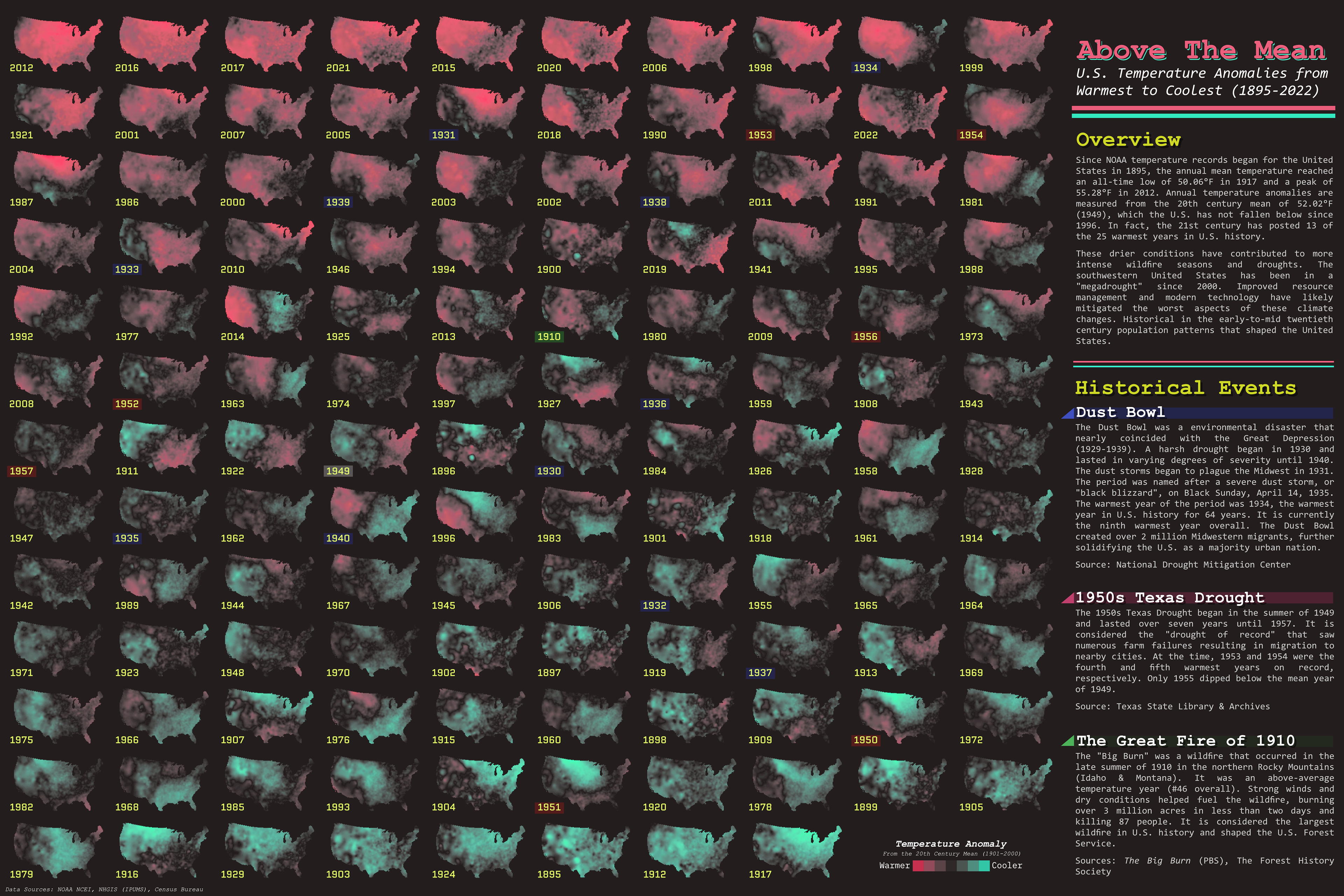
2022
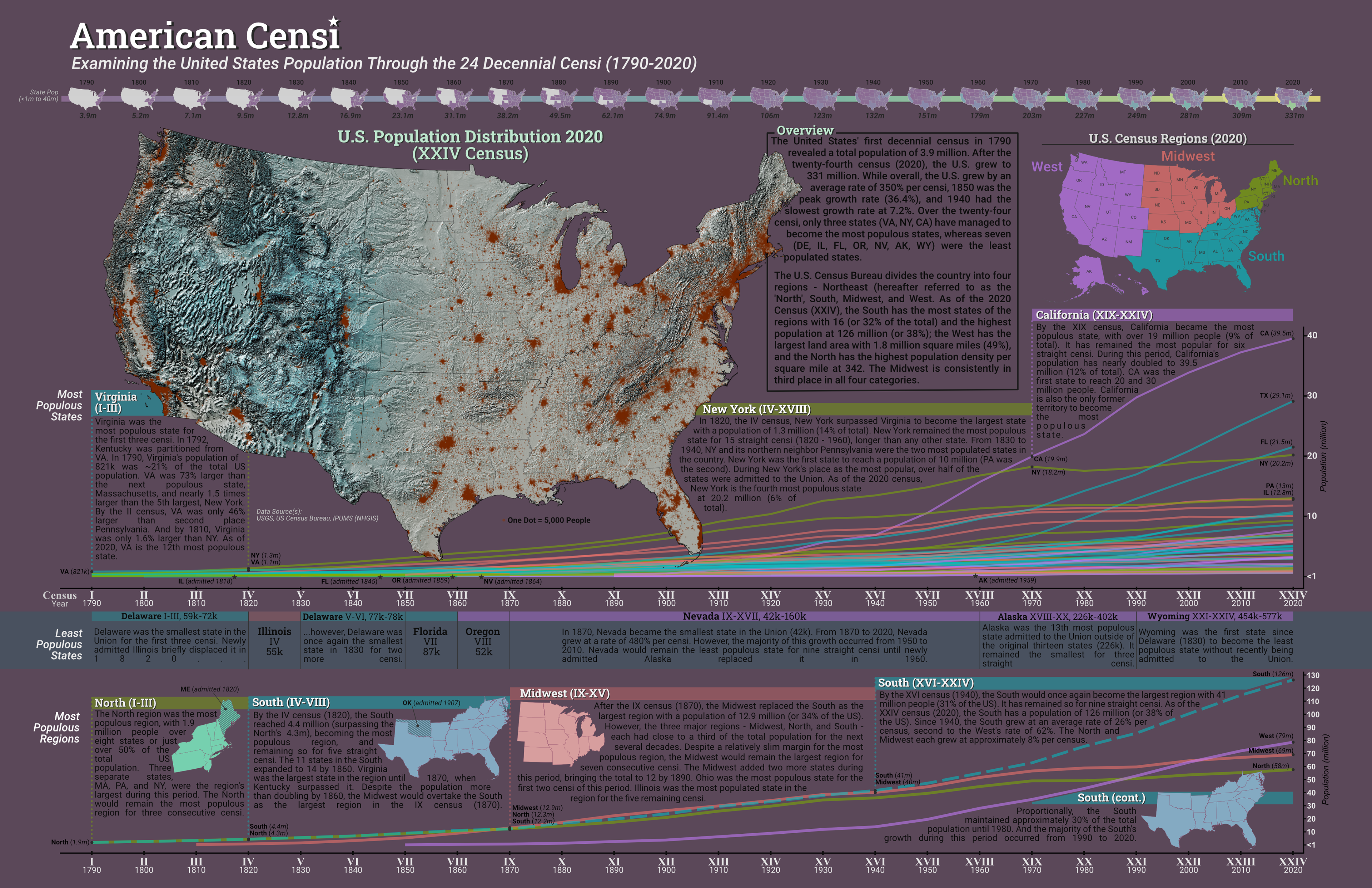
American Censi
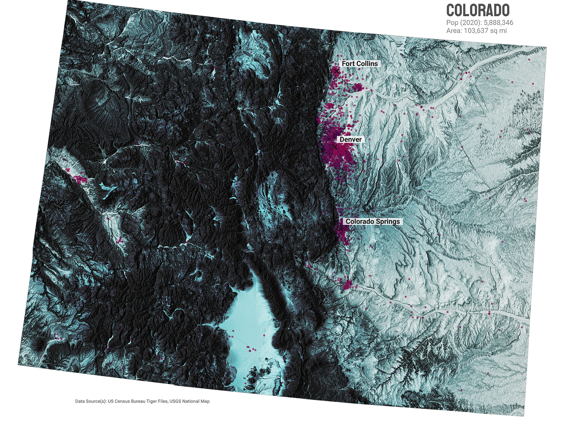
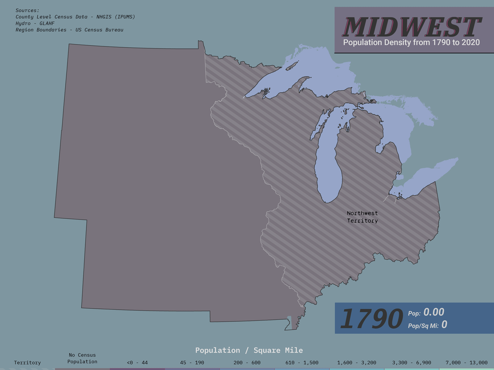
For this project, I wanted to examine the macro-level population dynamics in the decennial U.S. Census data.
I used R to clean up the data and make the line charts, as well as the small multiples choropleth at the top. The dot density and regional maps were made with ArcGIS Pro. And the final map was compiled with Affinity Designer.