Below are a few GIS projects I created as a graduate student at Johns Hopkins University.
Losing Southern Louisiana
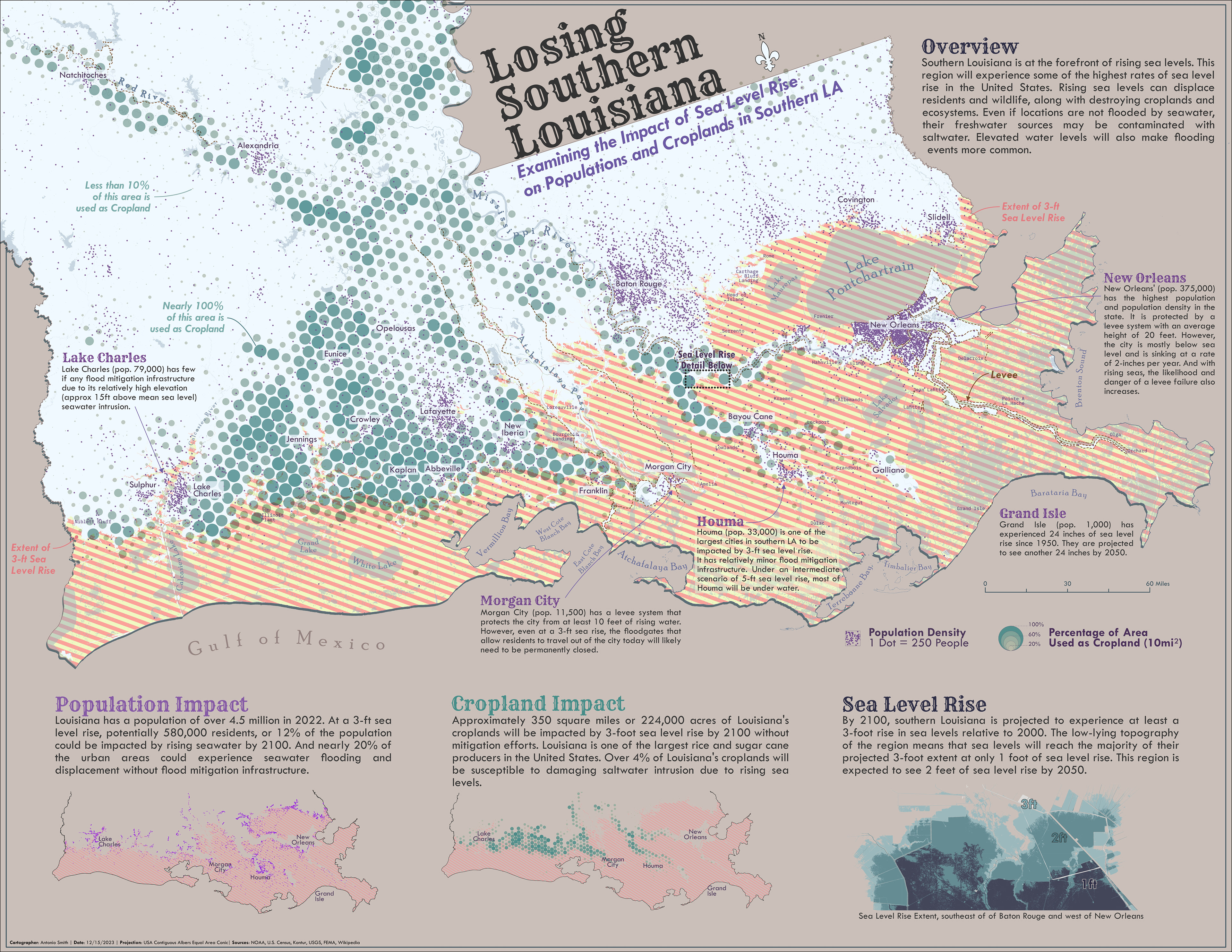
This map is a bivariate map showing the populations and cropland impacts of 3 feet of sea level rise in southern Louisiana. The maps were made in ArcGIS Pro and finished in Affinity Designer.
Knox County Migration Flow
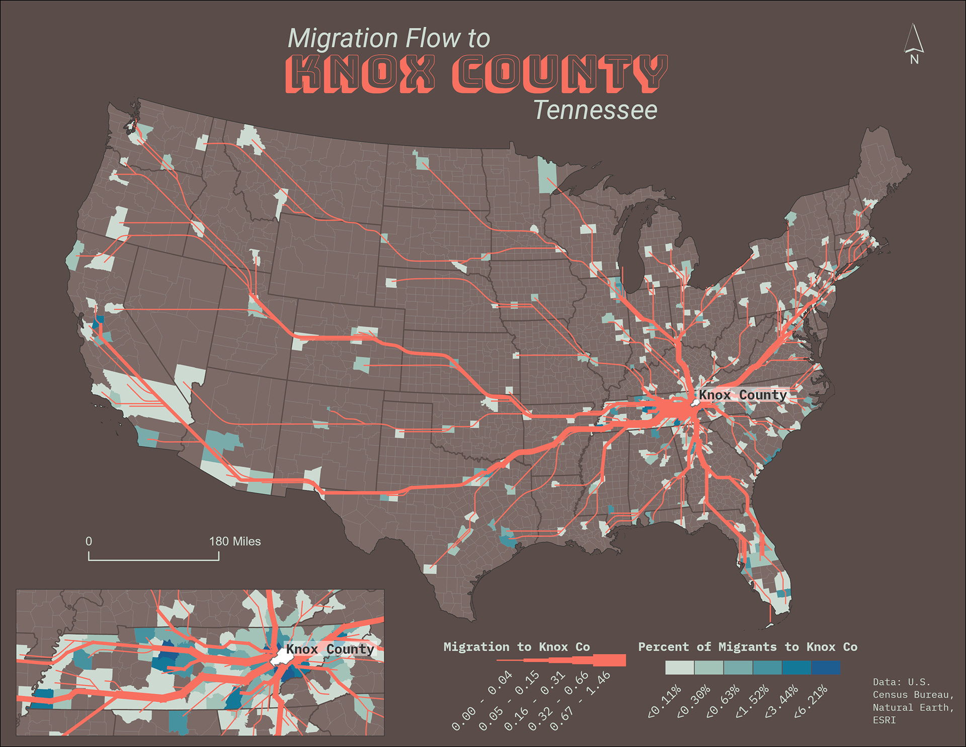
This map is a flow map showing the internal migration patterns to Knox County, TN.
Europe Wine Consumption

Spatial Distribution of Women in College
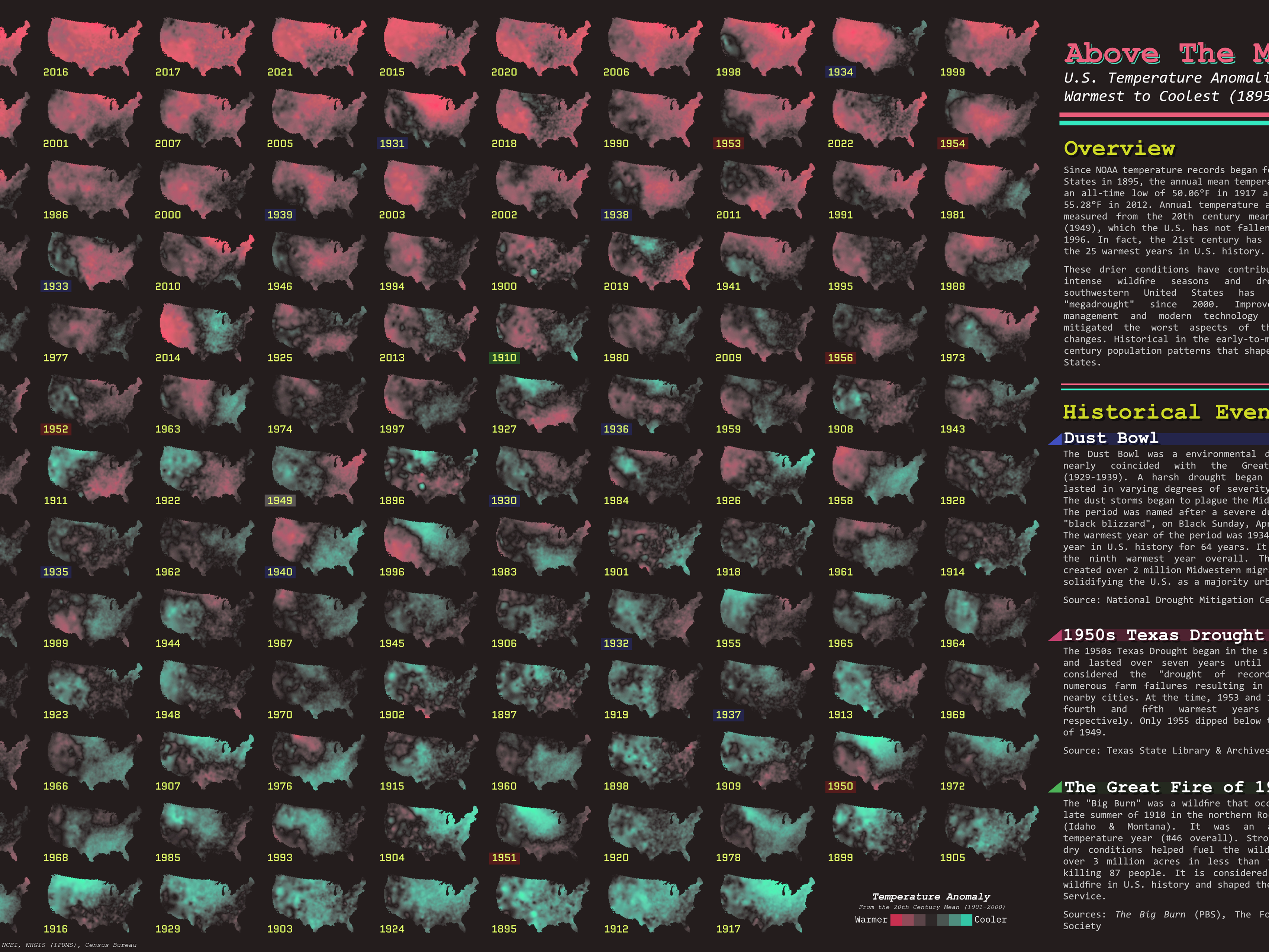
1895 - 2022 Temperature Anomalies in the Contiguous United States
A small multiples map showing annual mean temperature anomalies at the county level from 1895-2022. Anomalies are measured from the 20th-century (1901-2000) mean temperature.
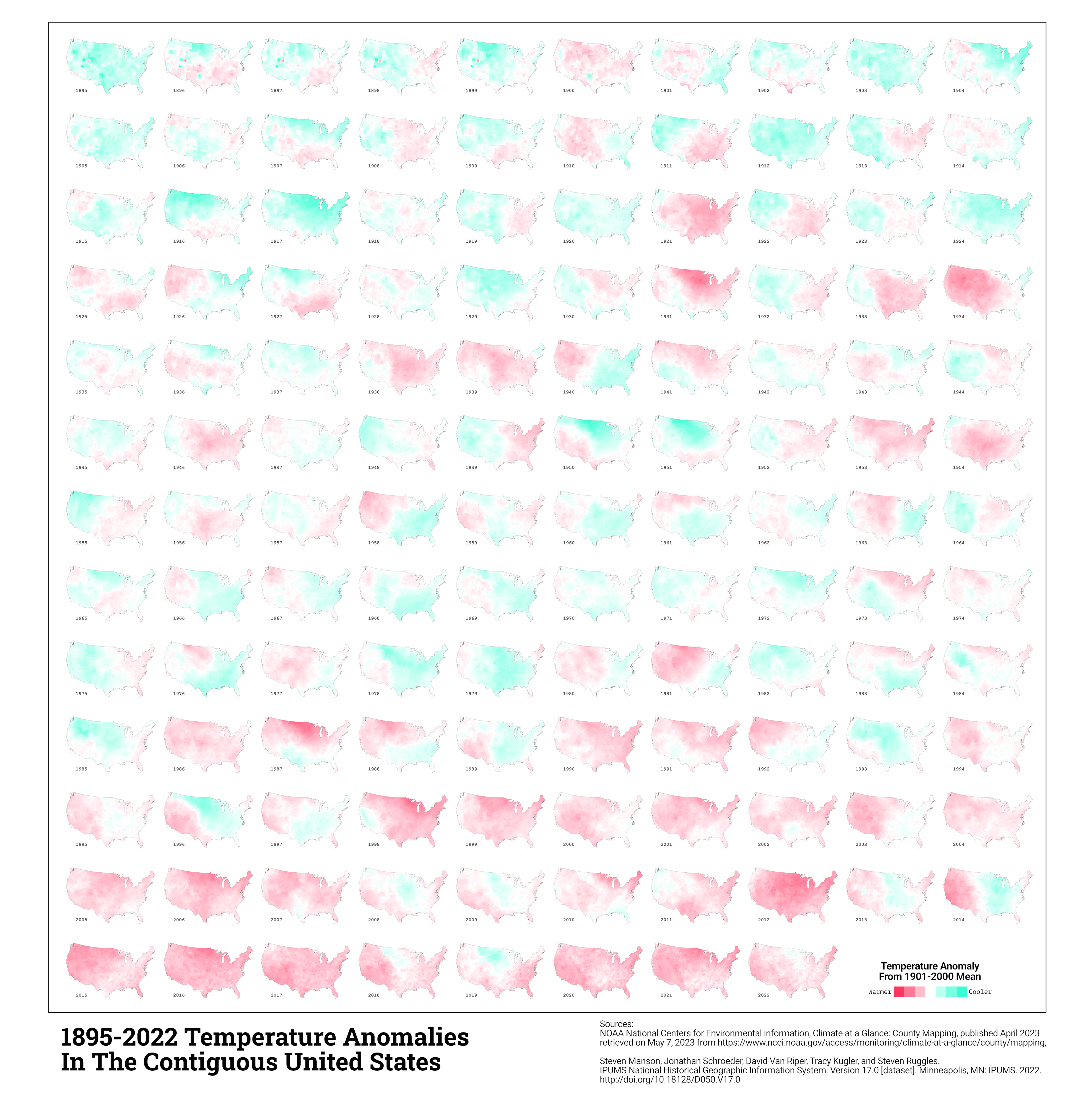
Tools Used:
R | ArcPy (Python) | ArcGIS Pro | ImageMagick | Affinity Designer
General Workflow:
-Downloaded the 128 years of data from NOAA NCEI as CSV files and formatted them in R.
-Joined data in ArcGIS Pro to identify missing county data (along with additional data cleaning).
-EB Kriging spatial interpolation data gaps; converted to points (ArcPy).
-Spatial Join krigged point data to counties (ArcPy).
-Symbolize county anomalies with Arcade rescale script to center divergent color ramp (pretty sure this a modified John Nelson script).
-Export to PNG with ArcPy.
-Tiled images with ImageMagick.
-Finalized map in Affinity Designer.
StoryMap: RSCC Campus Maps Project
The web map shows the locations of Roane State Community College's nine campus locations. The goal of this project was to create a dynamic web map to help students and visitors find their respective campuses. This map was made with ArcGIS Pro and ArcGIS Online.
StoryMap: A Very Warm Year (2020)
A brief look at 2020 county-level temperature anomalies.